Client
Your Build
Delivered
Branding
Print Material
Signage
Your Build aren’t new to the building industry, but with a shift in focus and relocation Georgina and Simon felt the brand deserved a new introduction.
Ideally the new brand needed to reflect Your Build’s extensive experience in the industry and echo their client focused ethos and communicative and collaborative build experience.
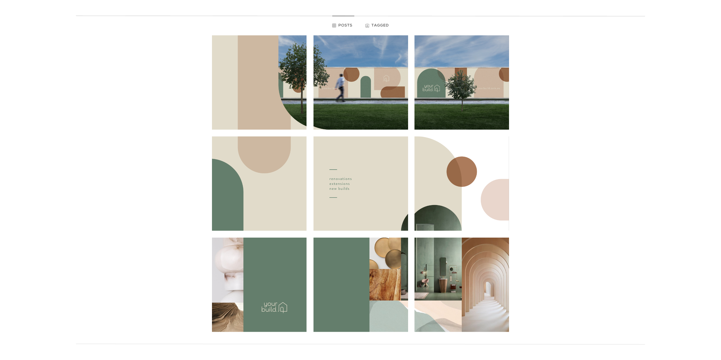
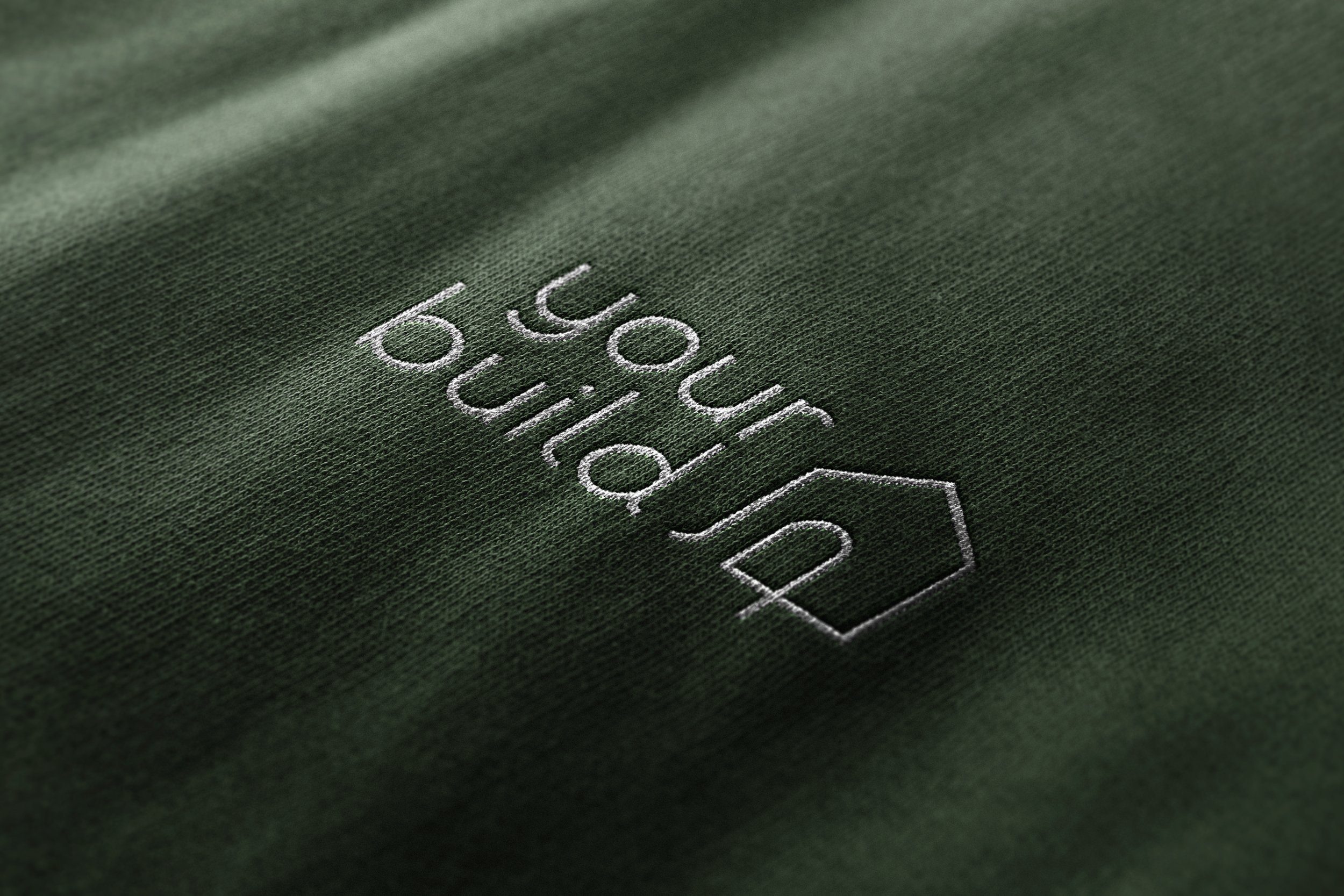
We created a combination mark that is a harmonious flow of lines and curves, friendly and modern. Hair line lettering symbolises Your Build’s fine attention to detail. The way the tail of the “l” hugs the “d” is a nod to their brand archetype - the caregiver.
The curved detail on the icon is almost invitational. The simplicity of the line lends itself to the build experience, easy to follow, with one central focus - YOUR BUILD.
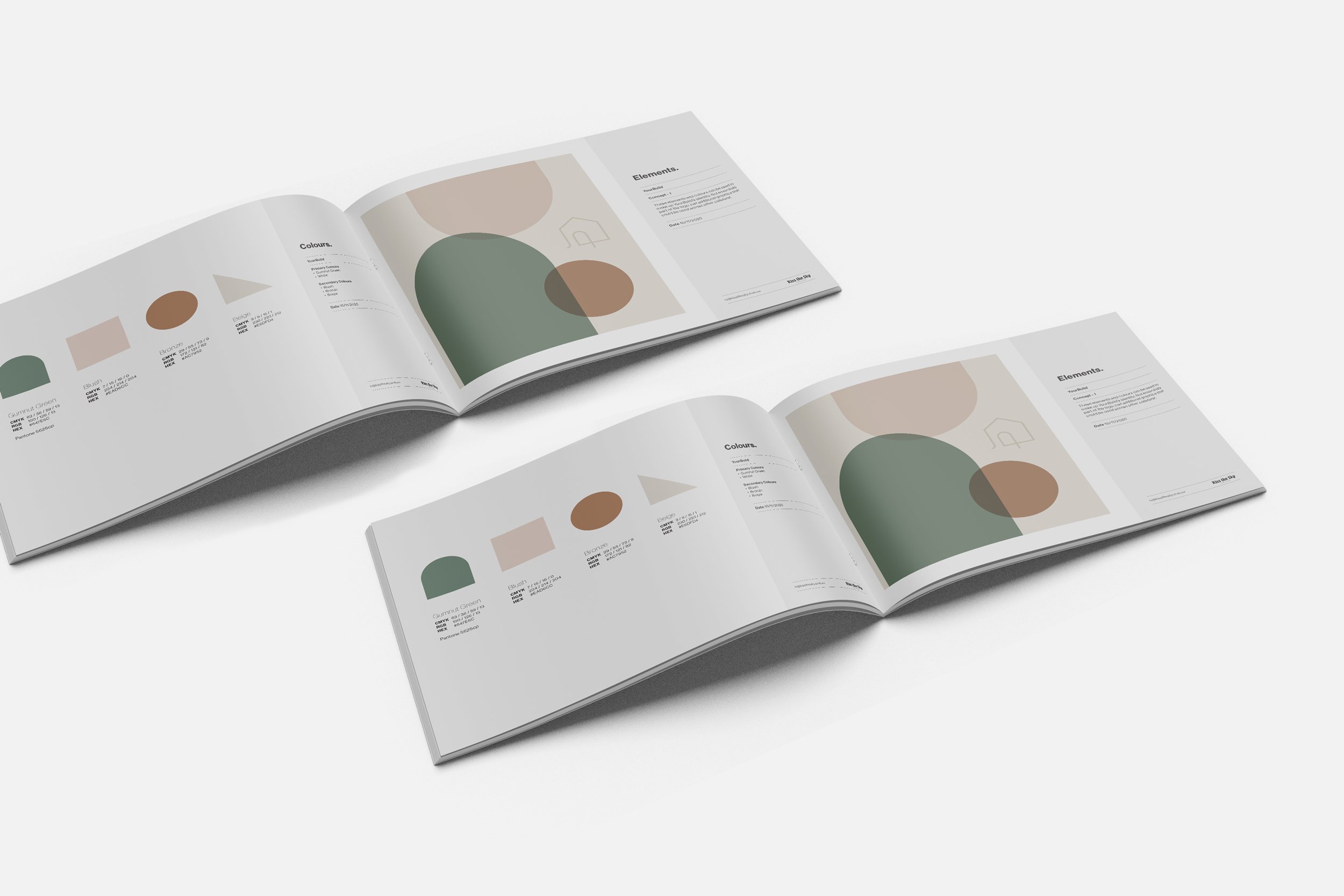
The exploration of simplified shapes and over lapping arches throughout the brand is an extension of their process - clear and collaborative.